
반응형

📌 개요
Matplotlib에서 하나의 그래프만 그리는 것은 시작에 불과합니다.
실무에서는 다음과 같은 작업이 매우 중요합니다.
- 하나의 Axes 안에 여러 개의 그래프 겹쳐 그리기
- 서로 다른 그래프 유형(Line + Bar) 함께 표현하기
- Axes 객체를 직접 제어하기
- 여러 개의 Subplots을 구성하여 대시보드 형태로 시각화하기
- 1차원 / 2차원 axes 배열 구조 이해하기
이 글에서는 위 내용을 실전 코드 기반으로 완전 정리합니다.
1️⃣ 하나의 Axes에 여러 개의 Plot 그리기
✔ 동일 Axes에 Line 여러 개 그리기
x_value_01 = np.arange(1,100)
y_value_01 = 2 * x_value_01
y_value_02 = 4 * x_value_01


plt.plot(x_value_01, y_value_01, color='green', label='temp_01')
plt.plot(x_value_01, y_value_02, color='red', label='temp_02')
plt.xlabel('x axis')
plt.ylabel('y axis')

plt.legend()

plt.title('Hello Plot')

plt.show()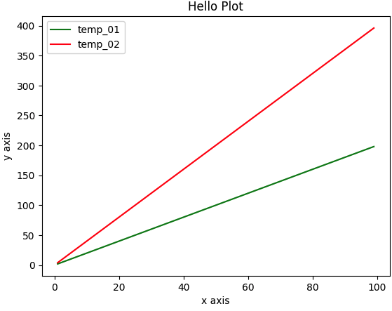
🔎 코드 설명
- np.arange(1,100)
→ 1부터 99까지의 숫자 배열 생성 (X축 값) - 2 * x_value_01, 4 * x_value_01
→ 서로 다른 기울기의 직선 생성 - plt.plot()을 두 번 호출
→ 하나의 Axes 안에 두 개의 선 그래프를 겹쳐서 그림 - label 지정 후 plt.legend() 호출
→ 범례 생성
👉 하나의 Axes 안에는 plot을 여러 번 호출하여 여러 그래프를 겹칠 수 있습니다.
2️⃣ Line Plot + Bar Plot 함께 그리기
x_value_01 = np.arange(1,10)
y_value_01 = 2 * x_value_01
y_value_02 = 4 * x_value_01

plt.plot(x_value_01,
         y_value_01,
         color='blue',
         label='temp_01',
         marker='o',
         linestyle='dashed',
         linewidth=2,
         markersize=6)
plt.bar(x_value_01,
         y_value_02,
         color='red',
         label='templ_02')
plt.legend()
plt.show()
🔎 코드 설명
- plt.plot() → 선 그래프
- plt.bar() → 막대 그래프
- 동일 Axes 안에서 서로 다른 유형의 그래프 혼합 가능
주요 스타일 옵션
- marker='o' → 점 표시
- linestyle='dashed' → 점선
- linewidth=2 → 선 두께
- markersize=6 → 점 크기
👉 Line + Bar 혼합 시각화는 비교 분석에 매우 유용합니다.
3️⃣ Axes 객체에서 직접 작업하기
pyplot 방식이 아니라, Axes 객체를 직접 제어하는 방식입니다.
figure = plt.figure(figsize=(10,6))
ax = plt.axes()
ax.plot(x_value_01,
        y_value_01,
        color='red',
        marker='o',
        linestyle='dashed',
        linewidth=2,
        markersize=6,
        label='temp_01'
        )
ax.bar(x_value_01,
       y_value_01,
       color='green',
       label='temp_02')
ax.legend()
ax.set_title(
    'Hello Plot'
)
plt.show()
🔎 핵심 개념
- plt.figure() → Figure 생성
- plt.axes() → Axes 생성
- ax.plot() → Axes에 직접 그래프 그림
- ax.set_title() → Axes 기반 제목 설정
👉 실무에서는 Axes 객체 기반 제어 방식이 더 많이 사용됩니다.
4️⃣ 여러 개의 Subplots 생성하기
✔ 1행 2열 구조 (Tuple 형태)
x_value_01 = np.arange(1,10)
x_value_02 = np.arange(1,20)
y_value_01 = 2*x_value_01
y_value_02 = 2*x_value_02

fig, (ax_01, ax_02) = plt.subplots(nrows=1, ncols=2, figsize=(12,6))

ax_01.plot(x_value_01, y_value_01, color='red', marker='o', linestyle='dashed', linewidth=2,markersize=6,label='temp_01')
ax_02.bar(x_value_02,y_value_02, color='green',label='temp_02')

ax_01.set_xlabel('ax_01 * axis')
ax_02.set_xlabel('ax_02 * axis')

ax_01.legend()
ax_02.legend()

plt.show()
🔎 설명
- nrows=1, ncols=2 → 가로 2개
- axes는 (ax_01, ax_02) 튜플로 반환됨
✔ 1차원 배열 형태
import numpy as np

x_value_01 = np.arange(1,10)
x_value_02 = np.arange(1,20)
y_value_01 = 2 * x_value_01
y_value_02 = 2 * x_value_02

fig, ax = plt.subplots(nrows=1, ncols=2,figsize=(12,6))
ax[0].plot(x_value_01, y_value_01,color='red', marker='o', linestyle='dashed', linewidth=2, markersize=6, label='temp_01')
ax[1].bar(x_value_02, y_value_02, color='green', label='temp_02')

ax[0].set_xlabel('ax[0] * axis')
ax[1].set_xlabel('ax[1] * axis')

ax[0].legend()
ax[1].legend()

plt.show()
👉 nrows 또는 ncols 중 하나가 1일 경우 → 1차원 배열 형태
✔ 2행 2열 구조 (2차원 배열)
import numpy as np

x_value_01 = np.arange(1, 10)
x_value_02 = np.arange(1, 20)
y_value_01 = 2 * x_value_01
y_value_02 = 2 * x_value_02

fig, ax = plt.subplots(nrows=2, ncols=2, figsize=(12, 6))

ax[0][0].plot(x_value_01, y_value_01, color='red', marker='o', linestyle='dashed', linewidth=2, markersize=6, label='temp_01')
ax[0][1].bar(x_value_02, y_value_02, color='green', label='temp_02')
ax[1][0].plot(x_value_01, y_value_01, color='green', marker='o', linestyle='dashed', linewidth=2, markersize=6, label='temp_03')
ax[1][1].bar(x_value_02, y_value_02, color='red', label='temp_04')

ax[0][0].set_xlabel('ax[0][0] x axis')
ax[0][1].set_xlabel('ax[0][1] x axis')
ax[1][0].set_xlabel('ax[1][0] x axis')
ax[1][1].set_xlabel('ax[1][1] x axis')

ax[0][0].legend()
ax[0][1].legend()
ax[1][0].legend()
ax[1][1].legend()

#plt.legend()
plt.show()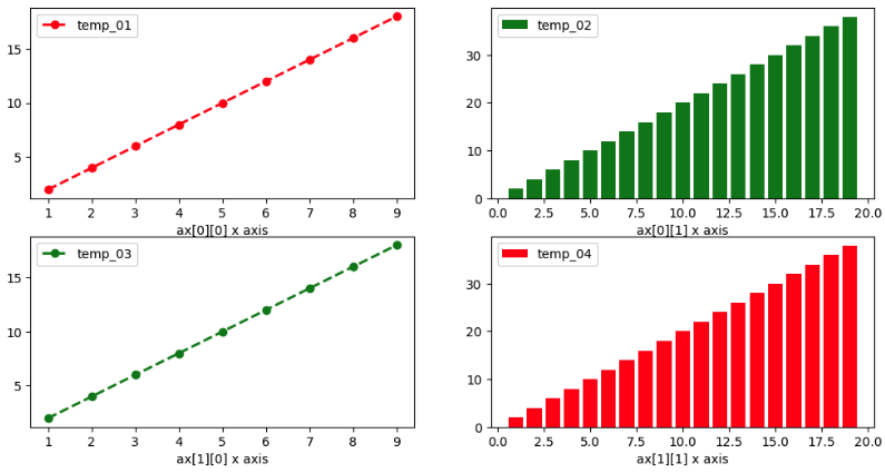
🔎 핵심
- nrows > 1 AND ncols > 1
→ 2차원 배열 형태 - 접근 방식
ax[행][열]
📌 정리
| 1행 2열 | 1차원 배열 |
| 2행 2열 | 2차원 배열 |
| 1개 | 단일 Axes 객체 |
Matplotlib에서 중요한 것은 다음입니다.
- 하나의 Axes 안에 여러 Plot 가능
- 서로 다른 그래프 유형 혼합 가능
- Axes 객체 기반 제어가 핵심
- Subplots 반환 구조를 정확히 이해해야 함
실무에서는 대부분:
fig, ax = plt.subplots()
→ ax 객체 직접 제어 방식
을 사용합니다.
반응형
'Programming' 카테고리의 다른 글
| Seaborn countplot & barplot 완전 정리 1 | 범주형 데이터 시각화 핵심 가이드 (0) | 2026.02.15 |
|---|---|
| Seaborn 차트 유형 완전 정리 | Histogram, Violin, Bar, Scatter, Line Plot 한 번에 이해하기 (0) | 2026.02.15 |
| Python Visualization Library 완전 정리 : Matplotlib (0) | 2026.02.15 |
| 데이터 시각화 핵심 개념 한 번에 정리 (0) | 2026.02.15 |
| Mercari Price Suggestion— 대규모 텍스트 + 카테고리 데이터를 활용한 가격 예측 실전 프로젝트 (0) | 2026.02.14 |